Building GattyPower: a responsive energy dashboard showcase
A layered turbine hero, readable mobile layouts, and sample charts: the final GattyPower build, with screenshots.
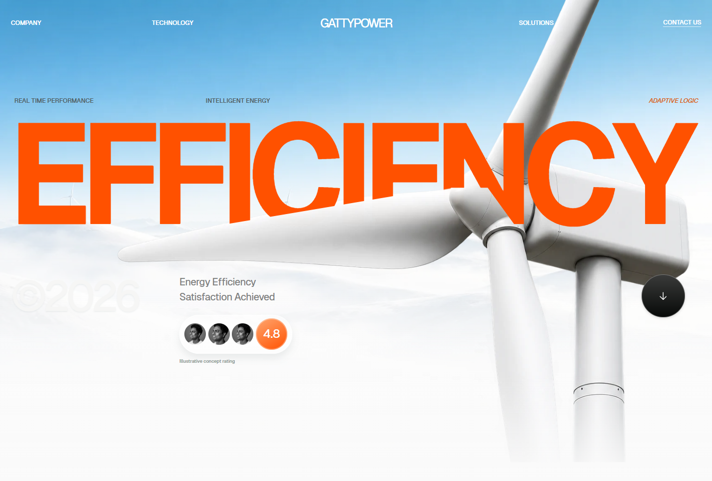
The wind turbine needed to cross the orange headline. A single background layer could not put the turbine both behind and in front of the headline. We split one transparent turbine into a rear layer and a clipped foreground layer, with real HTML text between them.
GattyPower is our energy-platform concept. This article now shows the finished homepage and the later phone layout pass. The site also has technology, solution, company, contact, and dashboard pages. Every energy reading is sample data; no meters or equipment are connected.
Matching the reference meant checking the small elements
The starting point was Aetheris, Energy Intelligence Platform, posted by Arhansyah APP for Plainthing Studio. We followed its small navigation labels, centered brand, oversized orange type, engineer panel, stacked project cards, and pale metrics section. GattyPower is a separate studio implementation, not a commission or collaboration with the original designers.
The first version captured the colors but missed several sections and the turbine overlap. We rebuilt the homepage, then checked each section in the browser against the supplied reference. That also caught a headline font-weight mismatch, cropped project lettering, and a hard edge in the metrics background.
The turbine cutout is about 60 KB, with a separate landscape of about 20 KB. Both are generated WebP assets. Using the same cutout twice lets the browser reuse one image file. A CSS clip-path reveals only the foreground blade. The headline stays selectable, and there is no canvas or 3D engine to initialize.
The tradeoff is precision across sizes. The mask, turbine position, and headline need to be checked together at each breakpoint. Generated photographs and the GattyPower wordmark also mean this is a close implementation, not a pixel-identical copy of the source.
The engineer panel gives the page a human scale
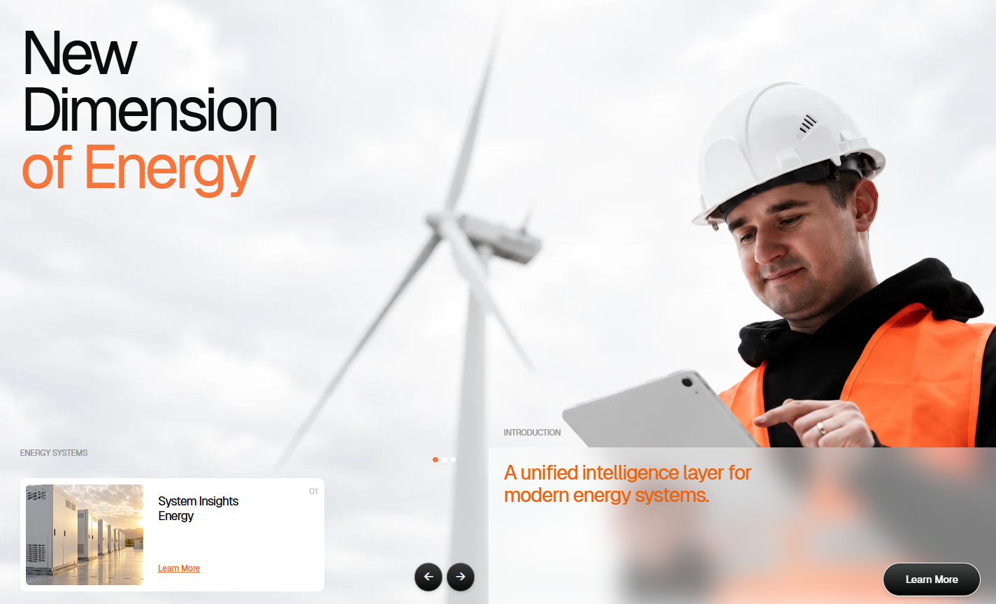
The frosted introduction panel keeps the orange text readable over the photograph. The arrows change the introduction and its numbered system card. This adds a useful interaction without moving the section around. The limitation is that the photograph is illustrative; a client should replace it with approved imagery of their own team.
Project cards and metrics need different jobs
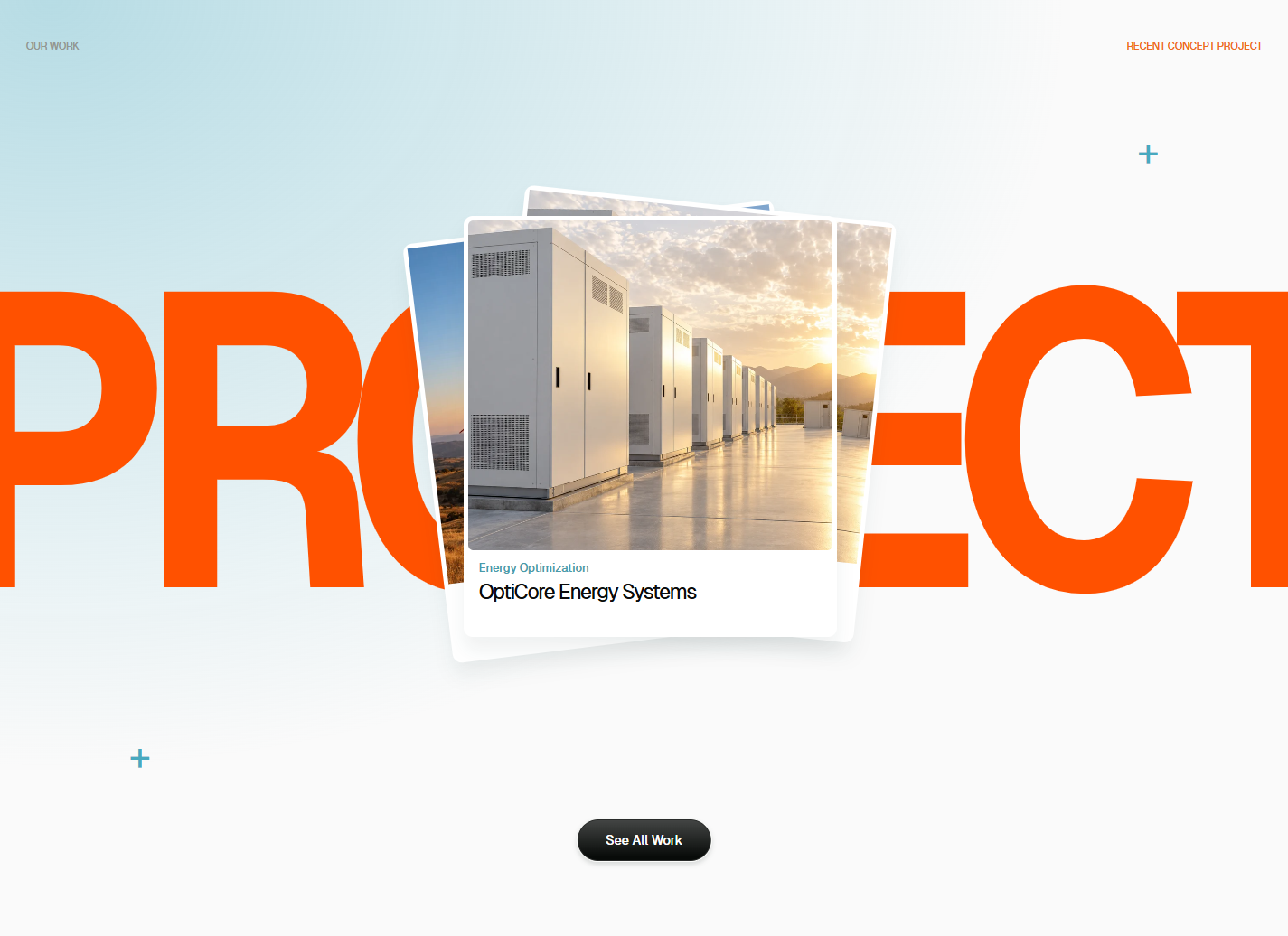
The project stack gives one item a clear place to click while preserving the large typography from the reference. Its two rear cards are decorative. This works for a featured project, but a real portfolio with many projects would need a listing with names and filters.
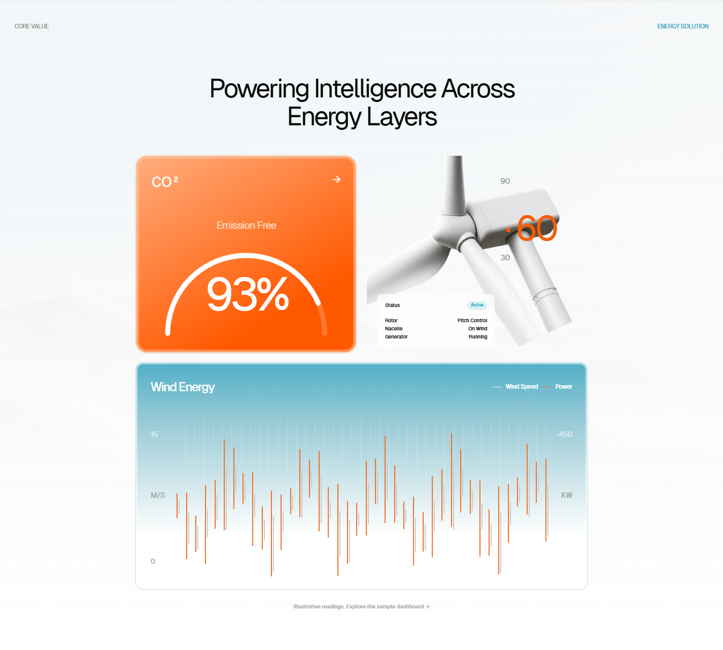
The gauge and chart introduce the energy theme quickly. They are not evidence of an actual 93% emissions result or live turbine output. Visible sample labels keep that boundary clear. The detailed dashboard is where readers can change a dataset and inspect exact values.
One dataset drives the dashboard
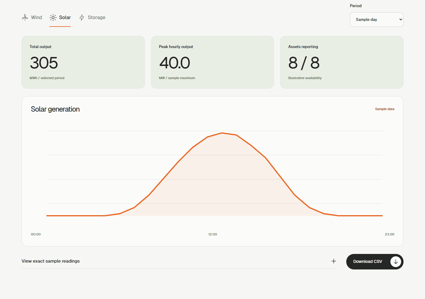
Wind, solar, and storage each have sample day and week views. A selection updates the graph, totals, asset count, exact-value table, and CSV together. This avoids a misleading demo where the graph changes but the numbers above it stay the same.
Units needed care. Hourly MWh readings imply average MW over one hour. A daily total cannot describe an instantaneous peak. The weekly view therefore labels its metric Highest daily average and divides the largest daily total by 24. The fixed dataset still does not test missing telemetry, delayed readings, time zones, or long histories.
Phones needed a different arrangement

Shrinking the desktop introduction left a tiny card, tiny labels, and a narrow text column. We moved its controls and copy into a panel below the image. The crop keeps the engineer visible, while the heading still has clear space. This costs vertical space, but the controls are easier to read and tap.
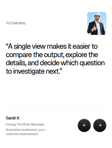
The testimonial used to squeeze its quote beside the portrait. The portrait now sits above it, and the quote gets a full row. Reserved text height reduces jumping between quotes. Shorter quotes leave some blank space, which is the deliberate tradeoff. These are labeled illustrative testimonials, not customer endorsements.
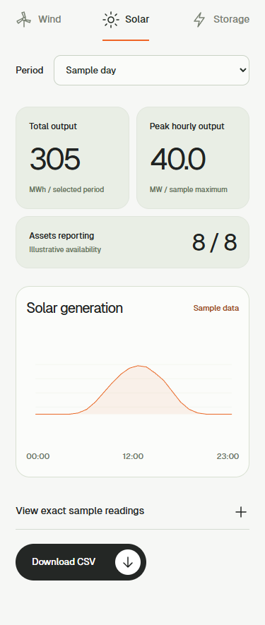
A separate metrics bug appeared when a minimum card height combined with an aspect ratio. One grid cell became wider than the other. Explicitly allowing both columns to shrink restored equal widths:
@media (max-width: 700px) {
  .ref-metrics {
    grid-template-columns: repeat(2, minmax(0, 1fr));
  }

  .ref-emission {
    aspect-ratio: auto;
    min-width: 0;
  }
}
The final checks covered a 320-pixel content width, a wider phone, tablet, and desktop. We checked page overflow, image crops, navigation, capability tabs, introduction arrows, testimonial arrows, and FAQ disclosures. This is browser verification, not a performance benchmark.
Astra helped produce the next version quickly
We used Astra with our image-generation, writing, and Cloudflare skills, carrying forward the lessons from GattyBite. The useful loop was concrete: build a version, inspect it, and fix the visible failure. The first result still needed correction.
Motion handles short content transitions. Content starts visible, and reduced-motion settings skip movement. We did not measure a speed advantage against another model, and we have not claimed a Lighthouse score for this release.
The screenshots and deployment need checking too
These screenshots were captured from the finished live site. Desktop images are 1,425 pixels wide. Phone captures retain their native 375-pixel width and display at 340 pixels in this article. We cropped to the relevant sections, removed browser scrollbars from the frame, and saved lossless WebP files. No image was enlarged to invent detail.
The site ships as static pages through Cloudflare. We verified that version.json matched merge commit d4e59a0 for the final mobile pass. The contact form opens an email draft for review; it does not report a message as sent. Privacy and terms identify the project as a studio concept.
Open the dashboard, switch Solar from a day to a week, and compare the graph with its table. For a client build, the next work would be approved imagery, real data contracts, timestamp rules, and missing-data states.